Showing posts with label tutorial. Show all posts

Saturday, August 15, 2009

Tutorial: Drop Shadows Tips

Another SA tutorial...

Here are a few tips to help improve your drop shadows:

- Try your opacity at 50% to start with. This is a good figure for many LOs/papers/elements etc....but feel free to change it to fit your LO.
-You may want a higher percentage for dark papers so it is more noticeable.
-You may want a lower percentage for light papers
- If you're element is 'high' off the page...increase the size (fuzziness) and lighten it (lower opacity) to make it more real. In real life shadows at a distance are not as sharp or dark.
-You can have coloured drop shadows if you like (if you're program allows) or you can use the standard black drop shadow with lowered opacity. This will allow the colour of the underlying paper to show through anyway.
-Sharp shadows are only for the midday sun...not your LO.
-Decide where you want the 'light' to come from for your LO, and make all the shadows head away from the light. Ie. don't change the angles of your drop shadows...keep them all the same within a LO or it won't look right.

- Your shadows SHOULD NOT be the focus of your page. In fact, they should barely be noticeable. People don't want to look at your page and say "ooohh..nice shadows!". The shadows should just be there to make the rest of the page look better..and hopefully one day, somebody will have to ask you if it is real or digi!

-look at real shadows and try to imitate them. I use this technique a lot lately. DH will be watching golf or some other crap and so i stare around the room looking at how the light affects everything! How it changes colours, how it creates shadows etc!

Here are some examples from the Scrap Addicts gallery. I'm going to use Melissa's LO's as I've already been through these tips with her using her own work as examples. Hopefully she won't mind!

Firstly here is a paper LO. You can see the shadows on the chipboard letters are quite dark and big but they are quite fuzzy. The shadows on the papers are barely noticeable, but they are there and they tell your brain that this Lo is paper.


This digi LO is when Melissa was playing around with her shadows trying to perfect them. It is good, but when you look at it, the shadows really pop out at you. We want the papers to pop off the page not the shadows and it is because they are too dark and too big.

And this is a new one of Melissa's. You really have to look to even see the drop shadows and that is great! They make the papers and elements pop, yet in themselves they are not a feature of the LO. Beautiful!

And in case she doesn't hate me enough already...here is a LO with a common drop shadow mistake - making the drop shadow go all the way around. You show me anything in real life where the shadow shows from all around the object. This is because the 'size' was too high.

Monday, August 10, 2009

Stroking Tutorial

Stroking is using a brush to go around an element in digital scrapbooking such as in my Mischka LO below. It can be done with a plain round brush to get a perfect line, or you can experiment with different brushes and spacing to achieve some fancy effects!


PS Instructions

To make a basic stroke is very easy. Choose the layer for the element you want to stroke and go to Layer>Style (or the little 'f' button at the bottom of the layers palette) and choose stroke. A menu will pop up and a red stroke will appear around your element.

Now you can change the colour by clicking the red box, and change the width of it by moving the size slider. The size is in pixels so a small element will want a small size and a large element will need a larger size for it to be seen. (Sorry for the bad example in the pic - the snowflake has sparkles which is why the storke has funny shapes to it!! What was I thinking?!)

Then click okay and you're done!

PSE Instructions - (thank you Melissa)

"
I selected my layer.. Went under edit, choose Stroke (outline) Selection.. then a box pops up and I can change the size, colour, location, the blending mode and the opacity."


Extracting Hair Tutorial

Okay I have been really slack with my tutorials...and I still have some at SA that I haven't shared here. So my plan is to copy them all over soon.

First off though is this tutorial for extracting hair/fur. And unfortunately it isn't mine! I wish I was clever enough to think of this, but I found it a few weeks ago and think it is so clever that I have to share. I still haven't tried it myself as I haven't done an extraction in a while, but I really can't wait to use it. So head on over to the ScrapbookGraphics blog and a huge thank you to Miss Behaving for this fantastic tut!

Tuesday, May 12, 2009

Tutorial: Stroke Tip - Bold Titles

Love a particular font, but it's just too thin to stand out on your page?

Want to click BOLD...but it just doesn't exist?

Just stroke it in the same colour. It will look just as if you have bolded it, but you can control how thick it gets!

When you are happy with it, create a new blank layer to merge down to and then you can add layer styles or clip as normal.

Friday, May 8, 2009

Tutorial: Drop Shadows basics

Ever wondered how digi pages sometimes look so real? Well when you look at a paper LO, you don’t notice them but there are shadows everywhere. They are subtle but they are there and our brain interprets the shadows as making the layout 3-dimensional and therefore … real.

So to imitate reality in digital scrapbooking, you need to get the drop shadows right. There are no set rules, and some people like them bigger or darker than others so play around and see what you like.
The instructions are very different for PS and PSE so I will treat them separately.


Basic guidelines: Thinner elements that are close together need thin drop shadows. For example a piece of paper sits very close to the cardstock, so has very little shadow.
Thicker elements or those that you want to stand off the page, need bigger shadows. For example a chipboard alpha or if you want the look of a flower lifted up with a pop dot.
In real life, shadows are not pure black, so your digital shadows should not be either. Either
lower the opacity so that the underlying colour and texture shows through, or make the shadow a darker hue of the element underneath it. For example, if your flower is on a red paper, your shadow would be a very dark red colour (if your program allows coloured shadows).

PSE 6 (and hopefully the other recent versions)
Click on the layer of the element you want to use. Under the Effects Palette, click on the symbol for Layer Styles. In the drop down menu, click Drop Shadows. Double click LOW, then double click SOFT EDGES. This will give you a nice, basic drop shadow which you can then adjust if you
want to.

To adjust your drop shadow, go to the Layers palette and double click the ‘fx’ icon. (This only
shows if you have used an ‘Effect’ on your layer.) A menu will pop up where you can change the size of the shadow and the distance. Increasing the size will soften it, and increasing the distance will make a bigger shadow ie your element ‘pops’ off the page more.
You can also change the opacity and lighting direction to give you even more control.


PS
Click on the layer of the element you want to use. At the bottom of the layers palette is a Layer Style icon – an ‘f’ in a circle. Click it and choose Drop Shadow and a pop up menu will appear. Firstly click on the black box at the top. Use the eye dropper tool to click on your underlying
element – ie the paper etc that is directly under the element you are working on. Now change your colour to a much darker tone by clicking underneath the point it gave you. Now adjust your distance and size following the above guidelines. The distance will move the shadow away from your element – imitating an element lifted off the page. The size will soften your shadow to make it more realistic. Sharp lines are only for the midday sun which is unlikely to shine on your digital layout!

Without shadows:
With shadows:

Wednesday, April 29, 2009

Tutorial: Dramatic Photos and Eyes

here is the other tutorial I wrote on Sunday :)

I always tweak my photos a little before scrapping and I love the brightness and contrast sliders as they are so easy to use. But lately, my favourite technique is to use blend modes to create
dramatic looking photos and it is much easier than it sounds!

(Not tested in PSE yet..sorry)

Firstly duplicate the photo layer twice and then delete the original (background layer) as this can't be edited.

Then play around with blend modes, opacity, brightness, contrast, saturation, curves and see what effects you can create! Here are 2 simple examples to get you started:

The first photo in the examples below is my original... I love this shot of DS but it is a little bit dull.

The second shot shows a moderate contrast increase. The bottom layer is untouched and the top layer has been changed to SOFT LIGHT at 100%. The SOFT LIGHT blend mode slightly darkens the dark areas, and slightly lightens the light areas. The top layer is blending with the bottom layer to create this.

The next shot shows a dramatic change to the original photo. I have greatly increased the brightness and contrast of the bottom layer (you can just see in the layer thumbnail how bright it is), and the top layer is set to MULTIPLY at 100%. The MULTIPLY blend mode greatly increases the dark areas of your photo, while leaving the light areas almost as they were. This gives the edges and dark areas a lot of contrast.

Now in both of the examples his eyes have gone very dark, and they are usually a bright blue. So I'm going to use blend modes to fix them!

Merge your layers (LAYER>MERGE DOWN or LAYER>MERGE VISIBLE).
Firstly you need to lasso the iris. Go slowly and and do a little bit at a time if you need to. Hold SHIFT to add to the selection, hold ALT to take away from it.
Now with both eyes selected, click LAYER>NEW>LAYER VIA COPY. This will put the eyes on a separate layer so you can play with them as much as you like! Now play with the blend modes, brightness, contrast, saturation, and even hue if the colour isn't what it should be (or you want to change the eye colour).


In my example I increased the contrast slightly, increased the saturation slightly and set the blend mode to LIGHTEN at 54%.


Blend Modes are heaps of fun to play with, and you can create amazing effects with them, but they can be very frustrating if you don't understand what they do. For instance some affect light areas, others affect dark areas and some affect both...and they won't all work for every photo.
For more information about what how the blend modes work...here is some good, but complicated info. Trial and error is probably easiest if you are starting out! lol


Sunday, April 26, 2009

Tutorial: Rounded Corners + FREEBIE!

So I want to round the corner of my photo...such a simple thing in paper as I'm sure everyone has a corner punch!! But how to do it digitally?
I have done it before and it was a PITA..so tonight I made a simple template to make rounding corners of photos and papers much easier!

Firstly download my templates HERE.


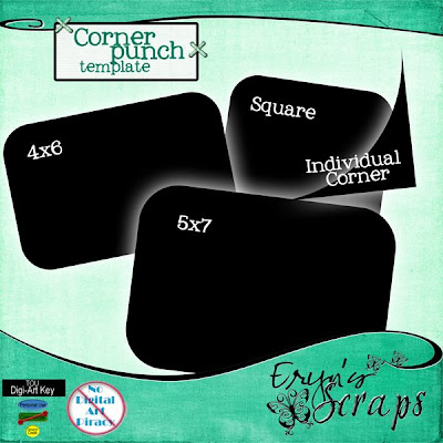
Now I made 2 types of templates...rounded photo templates in 4x6, 5x7 and square, and also an individual corner template.

For the full photo template, just drag into your LO underneath the photo layer, resize to fit your photo and then clip your photo to the template (CTRL-G). Make sure the photo layer is selected and above the template layer when you clip.


To use the individual corner template, drag it into your LO and resize to fit your photo.
The template needs to be exactly on the corner of the photo so we need to align them. Group the 2 layers (click the group checkbox).
Then choose the move tool and you should see the align tools at the top. Click the top/bottom and right/left to correspond with the correct corner to align both edges.


Now select the corner template (CTRL-click the layer). This should give you the marching ants around the corner. Now click on the photo layer and hit delete. LAYER>DESELECT and turn off the corner template (click the eye) and you should have a nicely rounded corner!
This template allows you to round papers or photos that do not fit the pre-sized templates, and also allows you to round only some corners.

Saturday, April 18, 2009

Tutorial: Digital Scrapbooking Programs

Here are the most common programs that you can use for digital scrapbooking:

Adobe Photoshop (PS): The industry standard. The biggest and best with the biggest price tag. Photoshop can do everything but it is quite difficult and time consuming to learn. If you are good with computers, do not like limitations or would like to design one day, then PS is for you.
PS 7 is the earliest version that is suitable for scrapbooking. Then it goes to PS Creative Suite (CS) 1, 2, 3 and 4. PS CS4 was recently released and retails for US $699. You may however, be able to pick up one of the earlier versions for next to nothing and the differences (for scrapbooking) are minimal in my opinion (for beginners). The latest version can be downloaded from the Adobe website and there is a free trial available.

Adobe Photoshop Elements (PSE): they took the most popular elements of Photoshop and made them easier to use. Elements is a much cheaper and easier program and will suit most people perfectly. In fact it is the most popular program for digital scrapbooking. It retails for US $140 and can be downloaded from Adobe or purchased in most electronics/ computer stores. However, there are limitations and while most people won’t notice them, if you like absolute control then you may want to look at PS. Early versions of PSE are often thrown in with scanners, printers, cameras etc so check your CDs to see if you put it away somewhere not knowing what it was. PSE4 and above are suitable for scrapbooking, but the higher the version, the better. Download the free trial HERE and then if you like it you can pay at the end of the trial. No need to get to a shop.

Corel Paint Shop Pro (PSP): A popular program that I know nothing about.

Ulead PhotoImpact: As above

Microsoft Digital Image Pro: has been discontinued by Microsoft but you may still be able to get a copy of it fairly cheap. It is not one of the more common programs, but is inexpensive and easy to use.

GIMP : this is a free program, but it is not very popular. I don’t know much about it and you will probably have trouble finding tutorials for it. It may be a great place to start though if you don’t want to spend any money.

Macromedia Fireworks: Sorry...not sure.

Tutorial: Starting Digi - What do you need?

Here is another tutorial that I wrote for The Scrap Addicts:

So you’re thinking about giving digi a go?? It doesn’t mean you have to give up paper and you may find (like I did) that it will improve your design skills and therefore paper scrapping. So how do you start and what do you need?

Well you don’t need very much at all actually. A computer with internet, photos on said computer, a program that uses layers (I will explain shortly) and a digi kit. I’m sure you already have the first two and you may have a program even if you don’t know it, or you can easily get one and they don’t have to cost very much.

And the digi kit is easy. There are 1000s of online stores that sell digital scrapbooking elements but you don’t need to spend a cent until you want to. There are so many sites that you can get freebies from and you could easily digi scrap for the rest of your life without buying a single thing. Google ‘digital scrapbook freebie’ and you will be spoilt for choice.

Once you have become addicted to digital scrapbooking and know your style and what you like, then you may want to go shopping, but until then it is safest to start out with the free stuff. And being free doesn’t necessarily mean that it isn’t good quality. Many sites have fantastic quality freebies.

Now on to the program. Digital scrapbooking requires a photo editing program that accepts ‘layers’. I will explain layers HERE. Older versions of some programs often get bundled with scanners, printers, cameras etc, so first thing is to check your CD stack for Photoshop Elements, Paint Shop Pro, Microsoft Image Pro etc. You may not have known what it was and put it aside somewhere. Or you can download a free trial version of a program. There is a quick run down of the most common programs HERE, but my suggestion is to download the Photoshop Elements trial. Find it HERE.

So now you have a program, download a kit from a freebie site and unzip it and you are ready to go. Check out my tutorial on how to start for some pointers.

Sunday, April 5, 2009

Tutorial: Template Tutorial + Freebie

Congratulations to Melissa for joining the Scrap Addicts A-Team! For her first challenge she has created this fantastic template which is available here.


Now due to some confusion and some of our digi gals being unsure as to what a template is, I decided to write a tutorial. I hope this will be helpful to anyone who has not used a template before :)


A template is the digital equivalent of a 'sketch' BUT...it is even easier to use!

After downloading and unzipping you need to open the 'layers' file in your program. This will be the .psd or .tiff file. I will be using Melissa's template for my examples.

There are 3 components of a template - the paper/photo layers, the element layers and the text layers.


Drag in a paper from a digital kit and in the layers palette, you need to move it to directly above the layer of the template you want to use.


Now hit CTRL-G. This will clip the paper to the template layer so that it is the same size and shape.


If you like, you can move, resize, rotate the paper to get the best part showing.
Repeat this for every paper layer and the photo/s layers.


Okay...elements.

The elements can be used as above if you like what Melissa has made, but they are intended to suggest where you might like to put your own elements. So drag in what you like, put it in the spot and then delete or 'turn off' the corresponding template layer.


Now the text. Click on the text layer, click on the text and delete Melissas. Write in your own words. You may have to change the font if the one used is not on your computer. You can also change the colours, size, and move it on the page if you like.


When you are done...save as a layered file (psd, tiff), then flatten to save as a jpeg.


Feel free to change or add to the template to make it your own. A template is designed to make your scrapping easier, but not to control it!

Also....if you would like to add styles such as drop shadows or bevels, you can add them to the template layer, or you can merge the clipped layers first. To merge the clipped layers, click the top one and then go to LAYERS>MERGE DOWN. This will merge them to create one normal layer that can be manipulated as normal. Have fun scrapping! :D

Tuesday, March 31, 2009

Tutorial: Basic Explanation of Layers...

This is a tutorial I wrote for The Scrap Addicts...and I thought I would post it here in case anyone needs a simple explanation! :)

A lot of people seem to get worried or put off by the term ‘Layers’ in digital scrapbooking. But it really isn’t that scary and once you have played around for a few minutes it is easily understood.

I find the easiest way to understand Layers is to relate them to traditional paper scrapbooking. For a paper layout you may have: a cardstock ‘layer’, a patterned paper ‘layer’, a photo ‘layer’, and flower ‘layers’. Each of these elements of the layout are separate and can be thought of as being layers of the layout.

Digital scrapbooking is exactly the same. You have a piece of ‘cardstock ‘ on one layer, a piece of ‘patterned paper’ on another layer, a photo on another layer and flowers all on separate layers. Then if you want to move your photo, you need to click on the photo’s layer to let the program know that is what you want to move. If you have two elements ie flowers, on the same layer, you can only move them together. If they are on separate layers then you can move then individually.

And that is the whole idea of layers. You want all of your elements to be separate so that they can be moved and changed individually.

Then at the end of paper scrapbooking, you glue all of your elements down - which essentially makes them act as one layer. In digital scrapbooking this is called flattening the layout. The program merges all of the layers together so that they act as one. This makes the file much smaller and allows it to be saved as a jpeg for printing or uploading to online galleries.